Surge Pro Wash
The problem
Pressure washing is a crowded local market where most companies use the same water-drop logo. Surge needed a brand that stands out on a moving van, reads on a yard sign from across the street, and still works as a tiny social avatar.
The approach
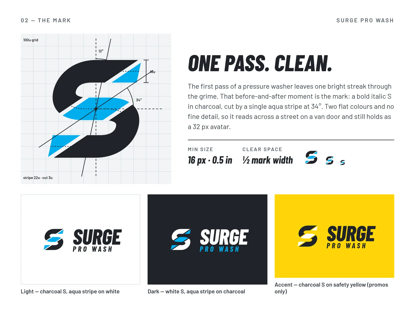
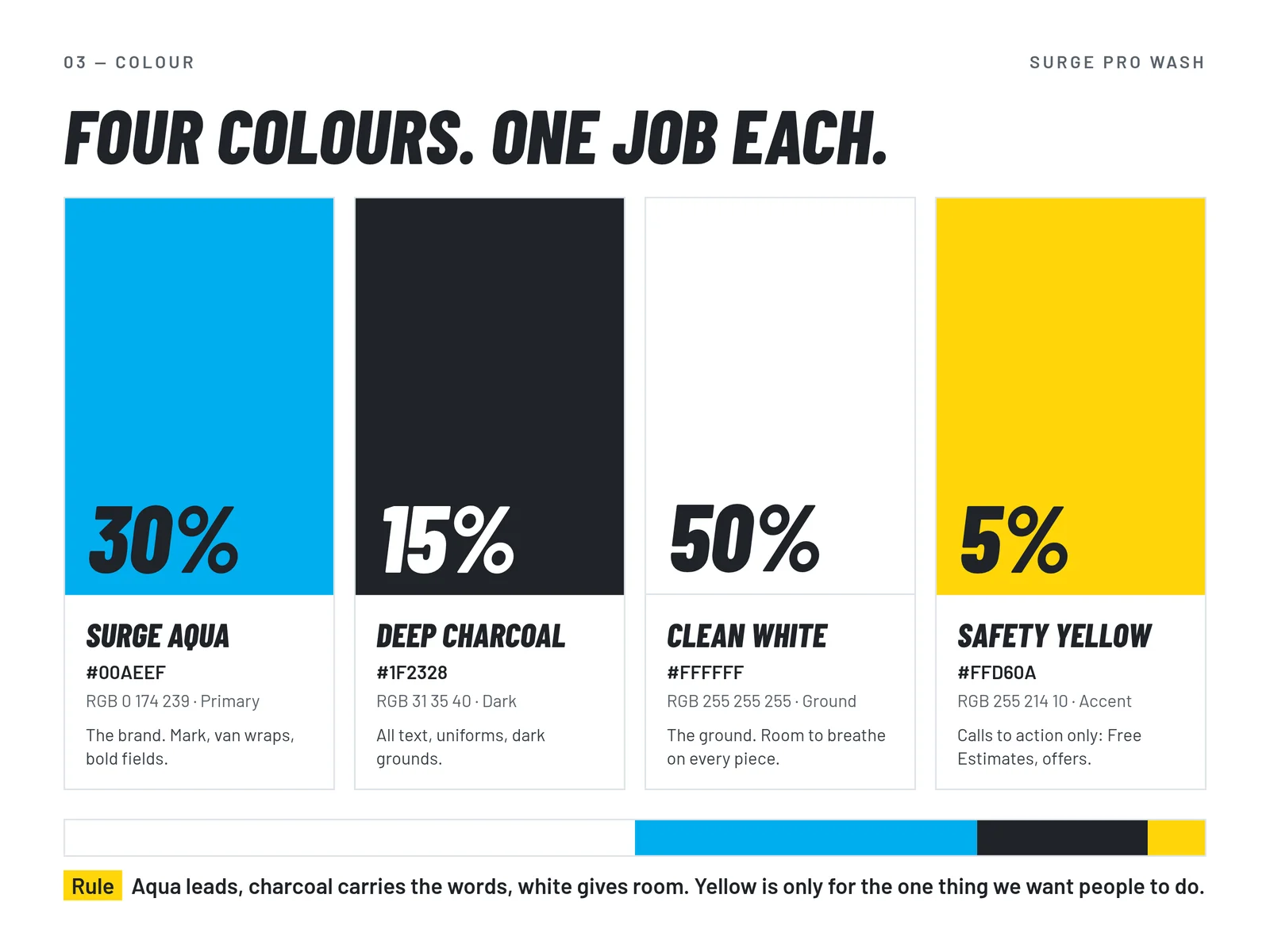
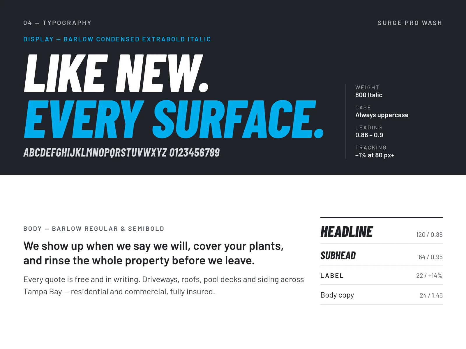
The identity is built on one idea: the clean stripe, the first bright pass through a dirty driveway. It is carried through the mark, the colour palette and the type system so it holds up at every size.
"One pass. Clean."
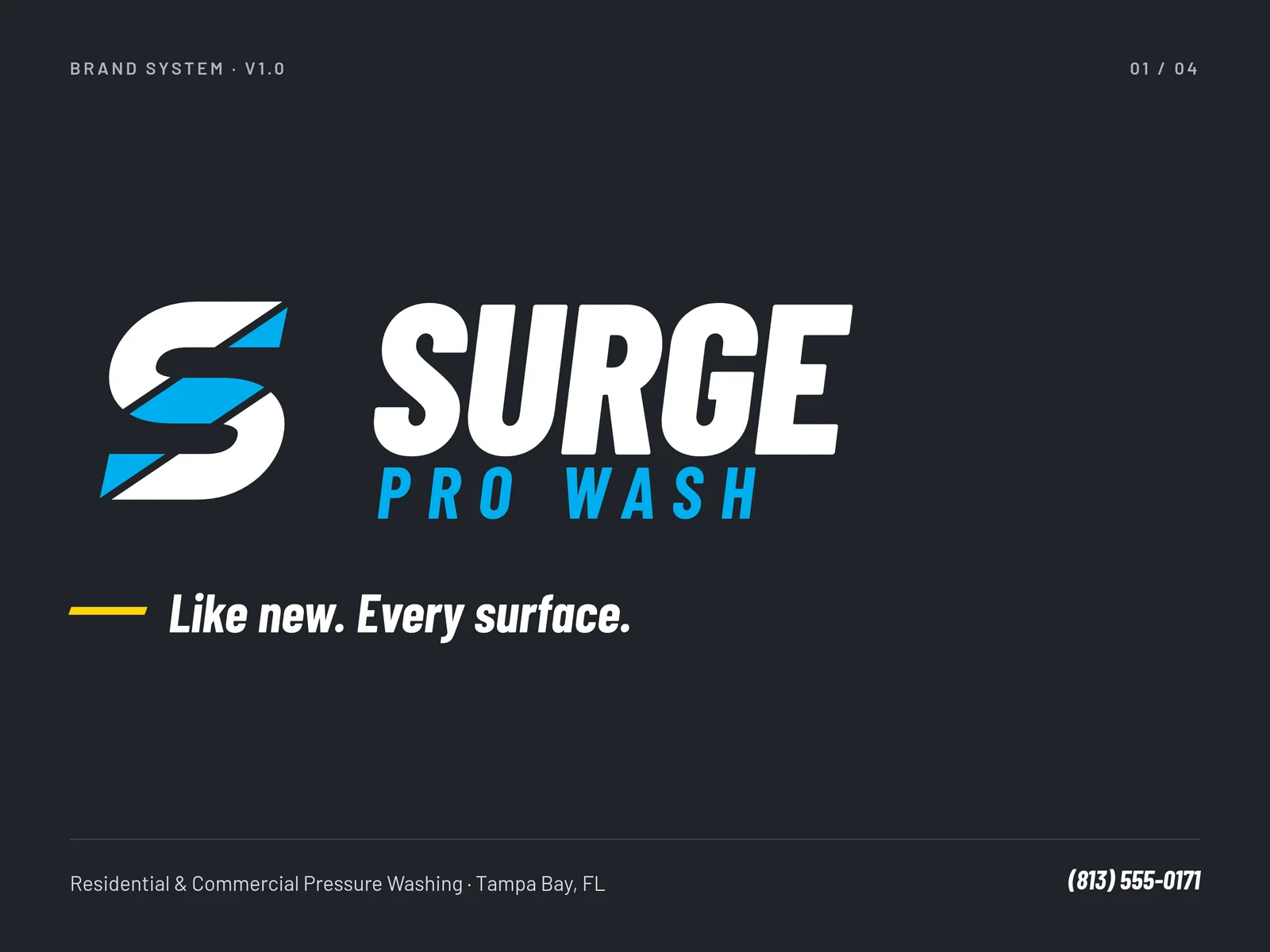
Tagline: "Like new. Every surface."
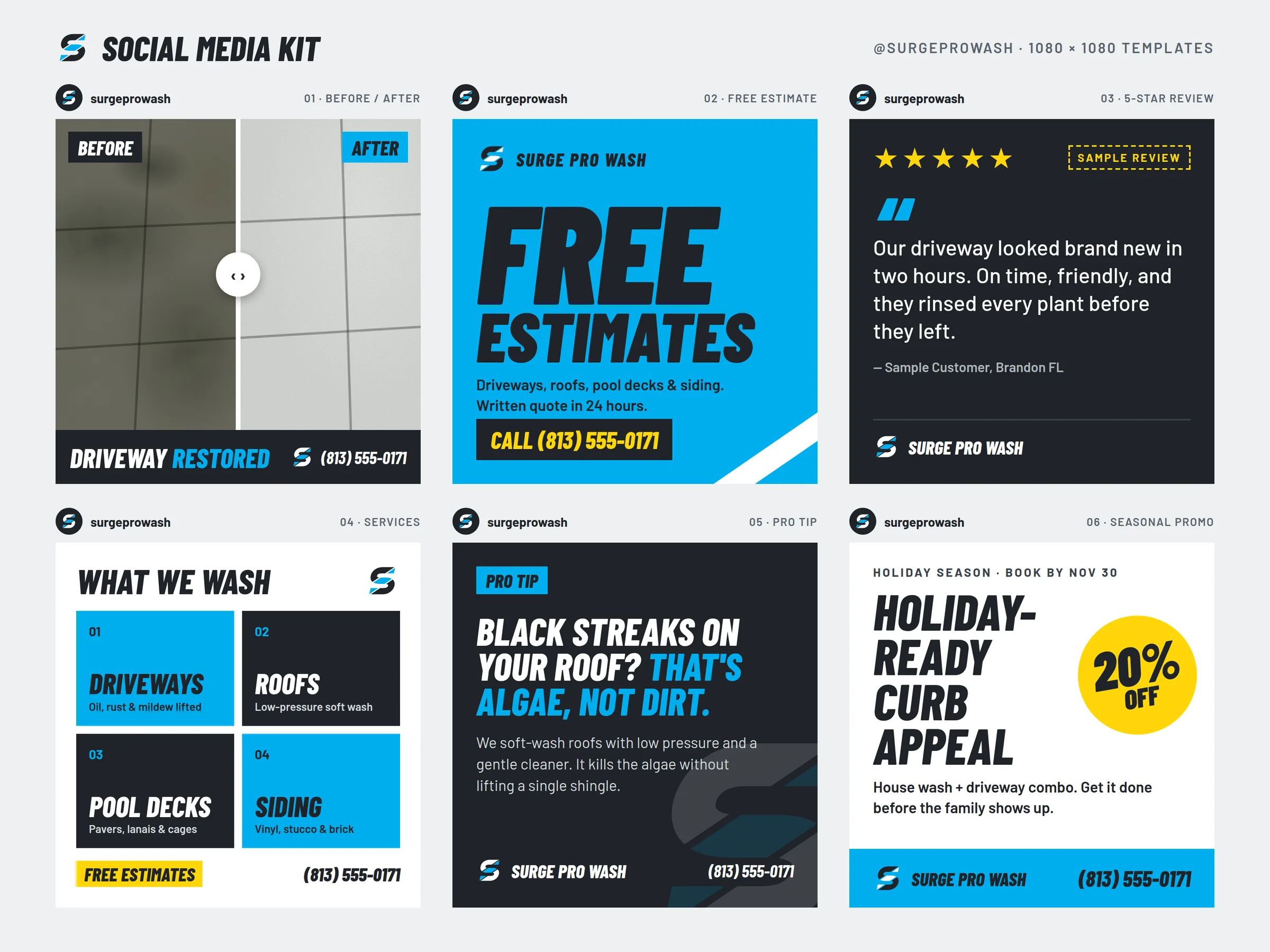
The social kit
A ready-to-post set of social graphics, so the brand shows up the same way on every feed from the first day.
The outcome
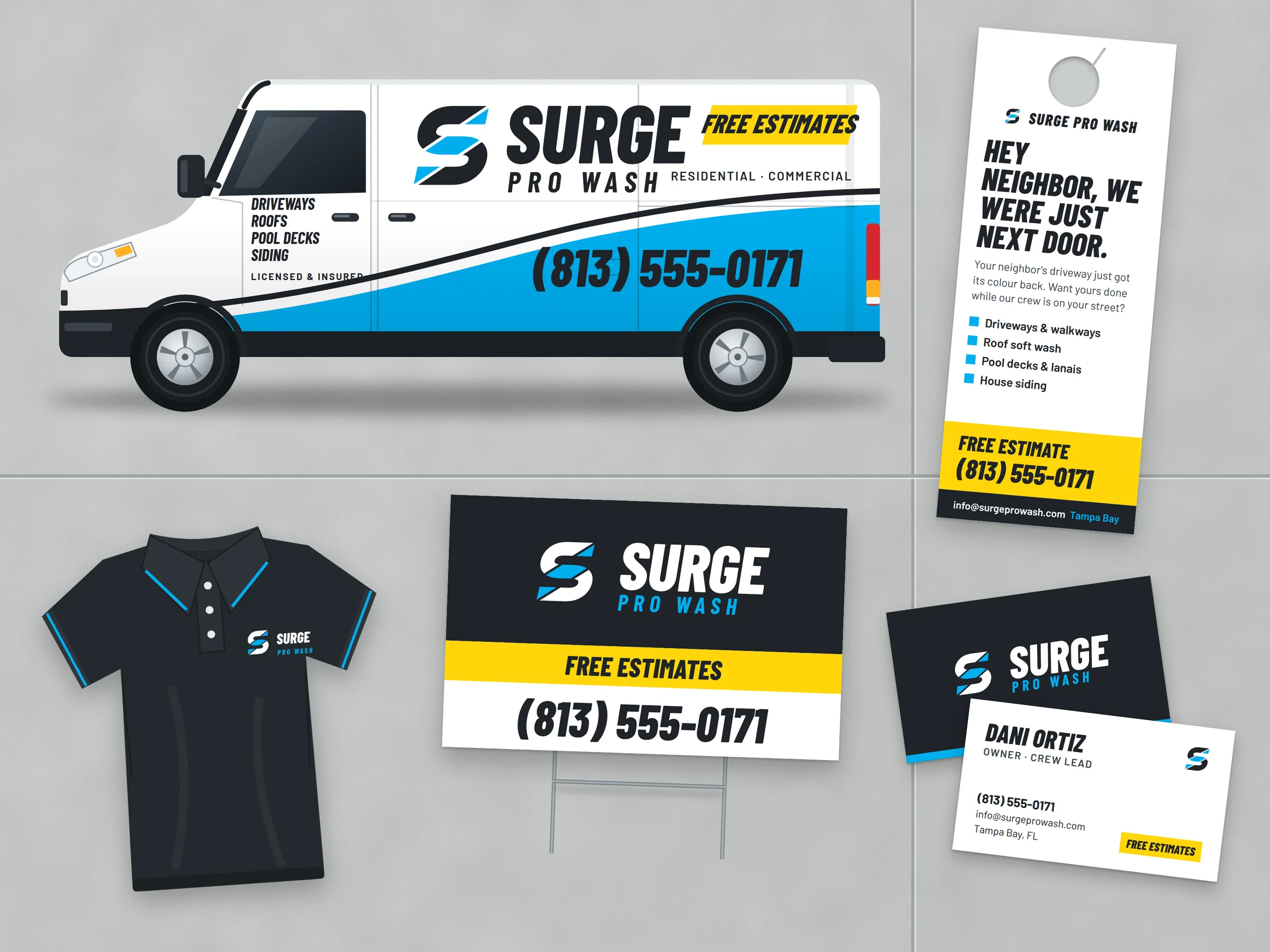
A mark built on the clean stripe, the first bright pass through a dirty driveway, carried across a van wrap, yard signs, door hangers, uniforms, and a ready-to-post social kit.
Concept projects show our full process from strategy to final design.